Table of Contents
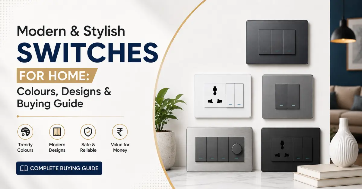
Switches are no longer something homeowners choose only after deciding the rest of the interior. In a modern home, the switchboard is visible every day and can either blend into the wall or become a deliberate part of the room’s design. Contemporary modular switches are available in a much wider range of colours, finishes, configurations and plate styles, making it easier to coordinate electrical fittings with walls, furniture, lighting and other interior elements.
Choosing modern switches for home therefore involves more than selecting a good-looking rocker switch. The colour, plate design, number of modules, current rating, switching arrangement and intended application all need to work together. A white switch can create a clean, seamless appearance, while black, grey or metallic options can be used to create contrast or coordinate with other decorative elements.
Whether you are building a new home, renovating an existing space or simply replacing old switches, the right combination can make the electrical fittings look much more integrated with the interior.
What Makes a Switch Modern?
The word modern does not refer to one particular colour or model. A switch can look contemporary because of its clean profile, modular arrangement, colour, finish or the way it complements the surrounding interior.
Clean and Minimal DesignModern interiors generally favour visually clean elements rather than unnecessarily complicated detailing. A simple switch and plate combination can therefore work particularly well with minimalist walls, contemporary furniture and uncluttered interiors.
Modular ConfigurationModular switches allow different electrical functions to be arranged within a coordinated plate. Depending on the system, a single installation can accommodate switches, sockets, fan regulators and other compatible modules. This makes the switchboard easier to plan around the actual requirements of the room. Legrand, for example, describes its modular switch ranges as combining contemporary design with different functions and configurations.
Colour and FinishColour is one of the easiest ways to change how a switchboard interacts with a room. White can blend with a light wall, black can create contrast, grey can provide a softer neutral appearance, while metallic shades can coordinate with decorative hardware.
A Coordinated SwitchboardA modern-looking installation is not necessarily about choosing the most decorative individual switch. The switches, sockets, regulators and cover plate should look like they belong together. This becomes particularly important when several functions are installed on the same wall.
Function Still MattersA stylish appearance should not override electrical requirements. Current rating, number of ways, module configuration and compatibility with the selected plate and accessories should be checked before purchase.
Modern Switch Colours for Different Home Interiors
Colour is one of the easiest ways to personalise modern electrical switches for home. But there is no single colour that works best for every interior.
The right choice depends on whether you want the switch to blend into the wall, create contrast or coordinate with another element in the room.
Eleczo’s switch inventory includes a broad range of colour options, including white, black, grey, metallic and several accent shades. This makes it possible to approach switch selection from an interior-design perspective rather than limiting the choice to conventional white fittings.
White Switches for Clean and Minimal Interiors
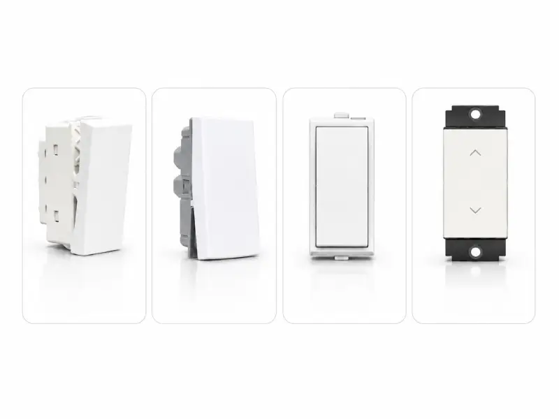
White remains one of the most versatile choices for modern homes. It works particularly well when the objective is to keep the electrical fittings visually subtle rather than making them a focal point.
A white switch on a white or very light wall can create a relatively seamless appearance, while the same switch can provide a clean contrast against darker wall colours. White also works naturally with light wood, neutral furniture, marble and minimalist interiors.
The important point is that white does not automatically mean traditional. Contemporary switch ranges continue to use white alongside newer colours and finishes. Legrand’s current Mylinc range, for example, continues to position white as a timeless and versatile interior choice while also offering newer finishes such as brushed platinum, charcoal oak and urban grey.
Best suited to
- White and light-coloured walls: Creates a seamless, clean look that blends naturally with the wall.
- Minimalist interiors: Keeps the switchboard subtle and maintains a clutter-free aesthetic.
- Scandinavian-inspired interiors: Complements the bright, simple and understated Scandinavian style.
- Light wood furniture: Pairs naturally with light wood tones for a warm, balanced look.
- Marble and neutral interiors: Enhances the elegant, soft tones of marble and neutral spaces.
- Visually unobtrusive switchboards: Helps the switchboard blend into the background rather than becoming a focal point.
Recommended White & Light-Coloured Switches
|
Product |
Type |
Suitable Interior |
|
White |
Clean & minimal |
|
|
Frost White |
Soft contemporary |
|
|
Absolute White |
Seamless/light interiors |
|
|
Chalk White / White Jazz |
Alternative white aesthetic |
Black & Deep Neutral Switches for Bold, Contemporary Interiors
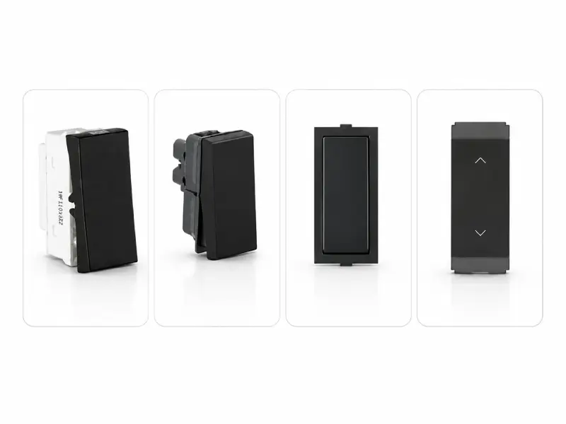
Black and deep neutral switches take the opposite approach. Instead of disappearing into the wall, they can become a deliberate visual element.
A black switch against a white wall creates a strong contrast, while charcoal or anthracite can produce a more restrained appearance. These colours can also work particularly well with wood, stone, concrete-look surfaces and darker furniture.
Darker colours and finishes are increasingly available across contemporary switch ranges, giving homeowners more options when they want switches to form part of the overall interior design.
Best suited to
- White or light walls: Creates a strong visual contrast, allowing the dark switch to stand out as a deliberate design detail.
- Wood-panelled interiors: Adds definition against natural wood tones while creating a balanced, contemporary look.
- Concrete-look surfaces: Complements the cool, architectural character of concrete-look surfaces and reinforces a modern aesthetic.
- Industrial-inspired interiors: Works naturally with materials such as concrete, metal and exposed finishes commonly associated with industrial design.
- Contemporary living rooms: Adds a refined visual accent that complements clean lines, modern furniture and neutral colour palettes.
- Darker furniture and architectural details: Creates visual continuity by repeating dark tones across furniture, fixtures and other architectural elements.
A useful rule is simple:
Use black when you want the switch to stand out; choose a softer dark neutral when you want a more subtle contrast.
Recommended Black & Deep Neutral Switches
|
Product |
Type |
Suitable Interior |
|
Black |
Strong contrast |
|
|
Charcoal Black |
Softer dark contrast |
|
|
Graphite Magnesia |
Contemporary/architectural |
|
|
Anthracite / Ebony |
Deep neutral interiors |
Grey & Mineral Shades for Subtle Modern Interiors
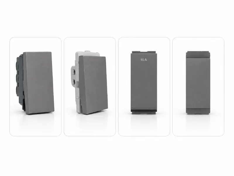
Grey sits between the extremes of white and black, which makes it useful when you want a modern appearance without creating a strong visual contrast.
Different grey shades can produce noticeably different results. A lighter grey can blend with neutral interiors, while a deeper grey can coordinate with charcoal furniture, stone surfaces or darker wall treatments.
Rather than treating grey as a single trend, think of it as a range of neutral options. This is particularly useful for homeowners who want something more distinctive than white but less visually dominant than black.
Best suited to
- Grey walls: A grey switch can blend naturally with the wall, creating a coordinated and understated appearance.
- Stone and marble interiors: Complements the natural grey tones and veining found in stone and marble, creating a cohesive look.
- Concrete-look finishes: Works naturally with concrete-inspired surfaces and reinforces a clean, architectural aesthetic.
- Minimalist homes: Keeps the overall palette restrained while adding subtle variation without creating strong visual contrast.
- Neutral furniture: Pairs easily with beige, white, cream and other neutral furnishings for a balanced, cohesive interior.
- Contemporary apartments and offices: Adds a refined modern touch while remaining versatile enough to work with clean lines and neutral palettes.
Grey can also be used for tonal coordination. For example, a medium-grey switch can sit naturally against a lighter grey wall without creating the high contrast produced by a black switch.
Recommended Black & Deep Neutral Switches
|
Product |
Type |
Suitable Interior |
|
Electric Grey |
Contemporary neutral |
|
|
Quartz Grey |
Stone/grey interiors |
|
|
Chic Grey |
Soft modern interiors |
|
|
Pebble Grey / Pristine Grey |
Minimalist interiors |
Metallic & Decorative Switch Colours for Accent Interiors
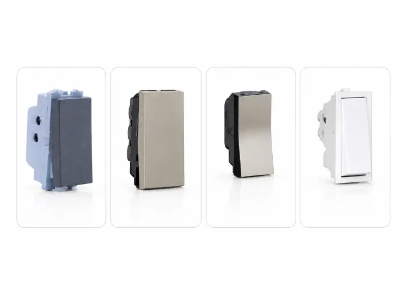
Metallic shades can be useful when the switchboard needs to coordinate with other decorative details rather than simply blend into the wall.
For example, a champagne-coloured switch can complement warm-toned hardware, while silver or titanium can work with cooler metallic elements. Black Gold can provide a stronger decorative contrast in rooms with dark wood or richer finishes.
This approach is consistent with the broader development of designer switch ranges, where colour and texture are increasingly considered part of the interior rather than an afterthought. Schneider Electric, for example, highlights the use of colour and texture to customise switches and sockets around an interior aesthetic.
Best suited to
- Contemporary living rooms: Metallic finishes can add a refined accent that complements modern furniture, clean lines and carefully chosen decorative details.
- Decorative bedrooms: Champagne, gold-toned or softer metallic finishes can introduce a subtle decorative element without overwhelming the room.
- Wood interiors: Metallic shades can create an attractive contrast with natural wood while adding a more polished contemporary touch.
- Warm neutral walls: Champagne, bronze and other warm metallic finishes can complement beige, cream and other warm neutral tones for a cohesive appearance.
- Modern luxury-inspired interiors: Metallic finishes can reinforce a sophisticated look when paired with materials such as marble, wood, glass and premium-looking surfaces.
- Rooms with coordinated metallic hardware: Matching or complementing the finish of switches with cabinet handles, lighting fixtures or other hardware can create visual continuity throughout the space.
The goal is not to make every element metallic. A small amount of coordination can be enough to connect the switchboard with lighting, cabinet handles, furniture hardware and other decorative details.
Recommended Metallic & Accent-Coloured Switches
|
Product |
Type |
Suitable Interior |
|
Silver |
Cool contemporary |
|
|
Titanium |
Modern neutral |
|
|
Champagne |
Warm/decorative |
|
|
Black Gold |
Dark & accent interiors |
How to Match Modern Switches with Your Wall Colour
Choosing a switch colour becomes much easier when you start with the wall instead of the product.
There are three basic approaches:
Blend: Choose a similar colour so the switch becomes less noticeable.
Contrast: Choose a significantly different colour to make the switchboard a visual feature.
Coordinate: Choose a colour that connects the switch with furniture, lighting, handles or another element in the room.
There is no universally correct approach. The right choice depends on how prominent you want the electrical fittings to appear.
Before choosing a finish, consider the wall’s undertone and the surrounding colours, materials and hardware, as these can affect how the switch appears in the finished space.
Switches for White Walls
White walls give you the widest range of options.
A white switch can blend into the wall for a clean appearance, while black or charcoal creates an intentional contrast. Metallic shades can also work when the room already contains silver, gold or other hardware.
|
Switch |
Colour |
Why it works with white walls |
|
White |
Blends into the wall for a clean, minimal look |
|
|
Frost White |
Creates a softer tonal appearance |
|
|
Black |
Creates deliberate visual contrast |
|
|
Champagne |
Adds a warm decorative accent |
Switches for Grey Walls
Grey walls can work with both tonal and contrasting switch choices.
A grey switch creates a more coordinated appearance, while white provides a cleaner contrast. Black creates a stronger visual break, and metallic colours can introduce a decorative element.
|
Switch |
Colour |
Why it works with grey walls |
|
White |
Creates a clean, crisp contrast |
|
|
Charcoal Grey |
Creates a deeper tonal, contemporary look |
|
|
Black |
Creates a bold visual break and stronger contemporary contrast |
|
|
Silver |
Adds a subtle metallic accent |
Switches for Beige, Cream & Warm Neutral Walls
Warm neutral walls generally work well with switch colours that either maintain the softness of the room or introduce controlled contrast.
White can provide a straightforward, low-contrast option. Champagne and other warm metallic tones can coordinate with warm furniture and hardware, while black can create a more defined visual element.
Recommended Switch Colours Beige, Cream & Warm Neutral Walls
|
Switch |
Colour |
Why it works |
|
White |
Creates a clean, crisp contrast |
|
|
Black |
Creates a bold visual break |
|
|
Dark Grey |
Creates a coordinated tonal appearance |
|
|
Titanium |
Adds a subtle metallic accent |
Switches for Dark Walls
Dark walls naturally create an opportunity for contrast.
White and lighter shades can stand out clearly, while metallic colours can add another layer of contrast without using a bright white. Dark switches can also be considered when the objective is a tonal, low-contrast appearance.
Recommended Switch Colours for Dark Walls
|
Switch |
Colour |
Why it works with with dark walls |
|
White |
Creates a crisp, high-contrast look against dark walls |
|
|
Frost White |
Provides contrast with a softer, less stark appearance |
|
|
Silver |
Introduces a reflective metallic accent while maintaining a contemporary feel |
|
|
Titanium |
Creates a more understated metallic contrast that works well with darker palettes |
Switches for Wood Interiors
Wood introduces warmth and texture, so the switch can either contrast with the wood or coordinate with other hardware.
Black and charcoal work particularly well when the goal is to create defined contrast against lighter wood. Champagne and other warm metallic shades can work when the room already uses warm metallic details.
Recommended Switch Colours for Wood Interiors
|
Switch |
Colour |
Why it works with wood interiors |
|
Black |
Creates defined contrast against lighter wood and adds a contemporary edge |
|
|
Charcoal |
Provides a softer dark contrast while maintaining a refined appearance |
|
|
Champagne |
Complements warm wood tones and coordinates with warm metallic hardware |
|
|
Black Gold |
Creates a richer decorative accent for darker wood and more luxurious interiors |
Switches for Marble, Stone & Concrete-Look Interiors
Stone and concrete-look finish generally provide a neutral architectural background, allowing the switch colour to either blend with the surface or create contrast.
Black and graphite can reinforce an architectural appearance, while grey can create tonal coordination. Silver and titanium can introduce a more refined metallic accent.
Recommended Switch Colours for Marble, Stone & Concrete-Look Interiors
|
Switch |
Colour |
Why it works with these interiors |
|
Black |
Creates strong contrast and reinforces a bold architectural look |
|
|
Graphite |
Adds depth while maintaining a sophisticated, contemporary appearance |
|
|
Grey |
Creates subtle tonal coordination with stone and concrete-inspired surfaces |
|
|
Silver / Titanium |
Introduces a refined metallic accent that works well with modern architectural finishes |
Should your switches match the wall or contrast with it?
There is no need to make every switch disappear into the wall. Equally, making every switch a contrasting feature can create unnecessary visual clutter. The better approach is to decide what role you want the switchboard to play within the overall interior. Matching, contrasting and coordinating are all valid approaches depending on the look you want to achieve.
Match the Wall for a Seamless Look
A switch in a similar colour to the wall can make the electrical installation visually quieter. This works particularly well in minimalist interiors where the emphasis is on furniture, artwork, lighting or architectural details.
Contrast for a Stronger Design Statement
A dark switch on a light wall, or a light switch on a dark wall, makes the electrical fitting more noticeable. This approach can work well when the switchboard is intended to become part of the room’s visual design rather than blend into the background.
Coordinate With Other Interior Elements
A third option is to coordinate the switch colour with another element in the room rather than matching the wall itself.
For example:
- Champagne switch + warm metallic handles
- Black switch + black lighting fixtures
- Silver switch + stainless-steel hardware
This creates visual consistency without requiring every element to have exactly the same colour or finish. The aim is to create a connection between the switchboard and the wider interior palette.<br>
The simplest rule is: match when you want the switch to recede, contrast when you want it to stand out, and coordinate when you want it to connect with the rest of the room.
Modern Electrical Switches for Home: What to Check Before Buying
Colour and appearance may be what initially attract attention, but they should not be the only factors considered when selecting an electrical switch. The designer switch should first be suitable for the intended electrical application, installation and overall switchboard configuration.
Check the Current Rating: Choose a switch with a current rating appropriate for its intended application and electrical load. A visually attractive switch is not automatically suitable for every appliance or circuit. Switch ranges are available in different ratings for different applications.
Check the Number of Ways: The required switching arrangement also matters. Depending on the installation, you may need a 1-way, 2-way or another compatible switching configuration.
Check the Module Configuration: If you are using a modular switchboard, make sure the selected switches, sockets and other accessories fit the required module arrangement. Products are designed for specific module sizes, so this should be checked before installation.
Consider the Complete Switchboard: Think beyond the individual switch. The final installation may include sockets, fan regulators, indicators, USB charging points and other accessories. Planning these together can help create a cleaner and more coordinated switchboard.
Check Compatibility: Switches, plates, frames and other accessories should belong to a compatible system. Check compatibility before combining components, particularly when using products from different ranges.
Don’t Sacrifice Electrical Requirements for Appearance: A switch should first be appropriate for its intended electrical application. Once the basic electrical requirements have been established, colour, finish and design can help you narrow down the options that suit the interior.
Explore Modern & Stylish Switches for Home at Eleczo
Eleczo brings together a broad selection of designer switches from brands including Anchor by Panasonic, Legrand, GM Modular, Norisys, Schneider Electric, Havells, Great White, Goldmedal and Hager. The catalogue includes different models, colours and configurations, allowing homeowners and project buyers to compare options according to both appearance and electrical requirements.
Instead of choosing only by brand, you can narrow down your selection according to the look you want — from clean white and subtle grey switches to black, metallic and other accent colours — and then check the relevant model and specification.
Frequently Asked Questions
Modern switches for home generally combine clean designs, modular configurations and a wider choice of colours and finishes with the electrical functions required for everyday use. The term does not refer to one specific model or colour; the right choice depends on the interior style and electrical requirements.
There is no single best colour. White works well for clean, minimal interiors, black and deep neutrals create stronger contrast, grey offers a more understated option, and metallic shades can be used as decorative accents. The best choice depends on the wall colour and overall interior palette.
Stylish switches are electrical switches whose colour, plate design, finish and configuration complement the surrounding interior. Modern modular switch ranges offer considerably more design choice than conventional plain switchboards.
White switches can create a seamless appearance on a white wall, while black or charcoal switches create stronger contrast. Metallic shades such as silver, titanium or champagne can be used when the switch is intended to coordinate with other decorative elements.
They do not have to. Matching the wall can create a subtle, seamless appearance, while contrasting colours can make the switchboard a deliberate design feature. A third option is to coordinate the switch with furniture, lighting or hardware instead.
Yes. Black switches can work particularly well with white walls, light wood, concrete-look surfaces and contemporary interiors. They can create stronger visual contrast than conventional white switches.
Check the required current rating, number of ways, module configuration, compatibility with the selected plate and intended electrical application. Appearance should complement these requirements rather than replace them.